I wear many hats at Showtime:
Art Director, Senior Animator, Creative Lead, and upholder of Brand Guidelines
Creative Services at Showtime is a lean, fast-paced department. Each member of the team handles multiple projects with multiple stakeholders on a daily basis.
Scroll down to see select project case studies:
A24 on Showtime
SXSW 2020 Showtime Campaign
Multi-title Social Acquisition Spots
Art Direction/Packaging Design for The Trade (2020), VICE, and On Becoming a God in Central Florida
︎︎︎︎︎︎︎︎︎︎︎︎︎
Showtime: The New Home of Award-Winning A24 Films
Indie film studio A24 will air their theatrical relases on Showtime Networks channels and streaming services through November 2022. In addition to new theatrical releases, Showtime will have exclusive rights to the television premiere of previous world-class A24 films, including Moonlight, Lady Bird, Room, and Ex Machina.
We wanted to create a campaign that would let people know about the new A24 on Showtime partnership; showcase the breadth of content available; and give a sense of the high-quality, artistically dense films viewers can expect from the A24 library.
The results marry the Showtime summer 2020 marketing campaign look (which relies on layered, twisting circles that evoke our Sho bug) with the tense, premium A24 aesthetic that immediately calls independent film to mind.
Theatrical image spots rolled out across multiple touchpoints,
including on-air, Instagram, and Snapchat.
Credits:
Garrett Wagner, SVP, Executive Creative Director
Christina Black, VP, Creative Director
Jonathan Rauberts & Ian Brier, Sr. Creative Directors
Mario de Toledo-Sader, Art Director
Amber Kusmenko, Senior Animator
Soon Kwon, Studio Director
SXSW 2020
SXSW was cancelled because of the pandemic, but we had a hell of a campaign planned! Each year Showtime decks out The Showtime House in the style of The Alibi Room bar from Shameless. Creative Services’ task: get the SXSW crowd excited about The Showtime House, our events and musical guests, and our tentpole shows.
The creative direction for SXSW was to partner with an illustrator to reskin Showtime branding and series key art into something more eye-catching and more appealing to the art and tech-savy crowds of Austin. This year we chose Brazilian illustrator Pedro Correa, whose gloopy lines and freaked-out eyes perfectly evoke a bad Frank Gallagher bender.
The event schedule for The Showtime House [would have] played between looping promos for our tentpole series. In past years we also worked closely with the social team to create [what would have been] must-share stickers.
Credits:
Garrett Wagner, SVP, Executive Creative Director
Christina Black, VP, Creative Director
Laura Molins, Creative Director
Amber Kusmenko, Art Director
Christina Nahas, Broadcast Designer
Justin Acree, Senior Animator
Masayoshi Nakamura, Cell Animator
Diana Roach, Line Producer
Renee Haar, Senior Producer

Multi-title Social Spot with Acquisition Marketing Language
We needed to highlight the variety of content Showtime offers and drive awareness of series. It took a bit of pushing on my part (and the EP’s) to get the team to try something new for this spot, but it performed so well that they came back for series-specific and Instagram feed versions. The animation can either be played through (for Snapchat and Instagram) or broken into 3-4 consecutive sections to be run as an Instagram Carousel Story Ad.
Credits:
Christina Black, VP, Creative Director
Mark Shea, Creative VP
Jennie Ciminelli, Executive Producer
Amber Kusmenko, Senior Animator & Art Director
Christina Nahas, Broadcast Designer
Packaging Design: On Becoming a God in Central Florida
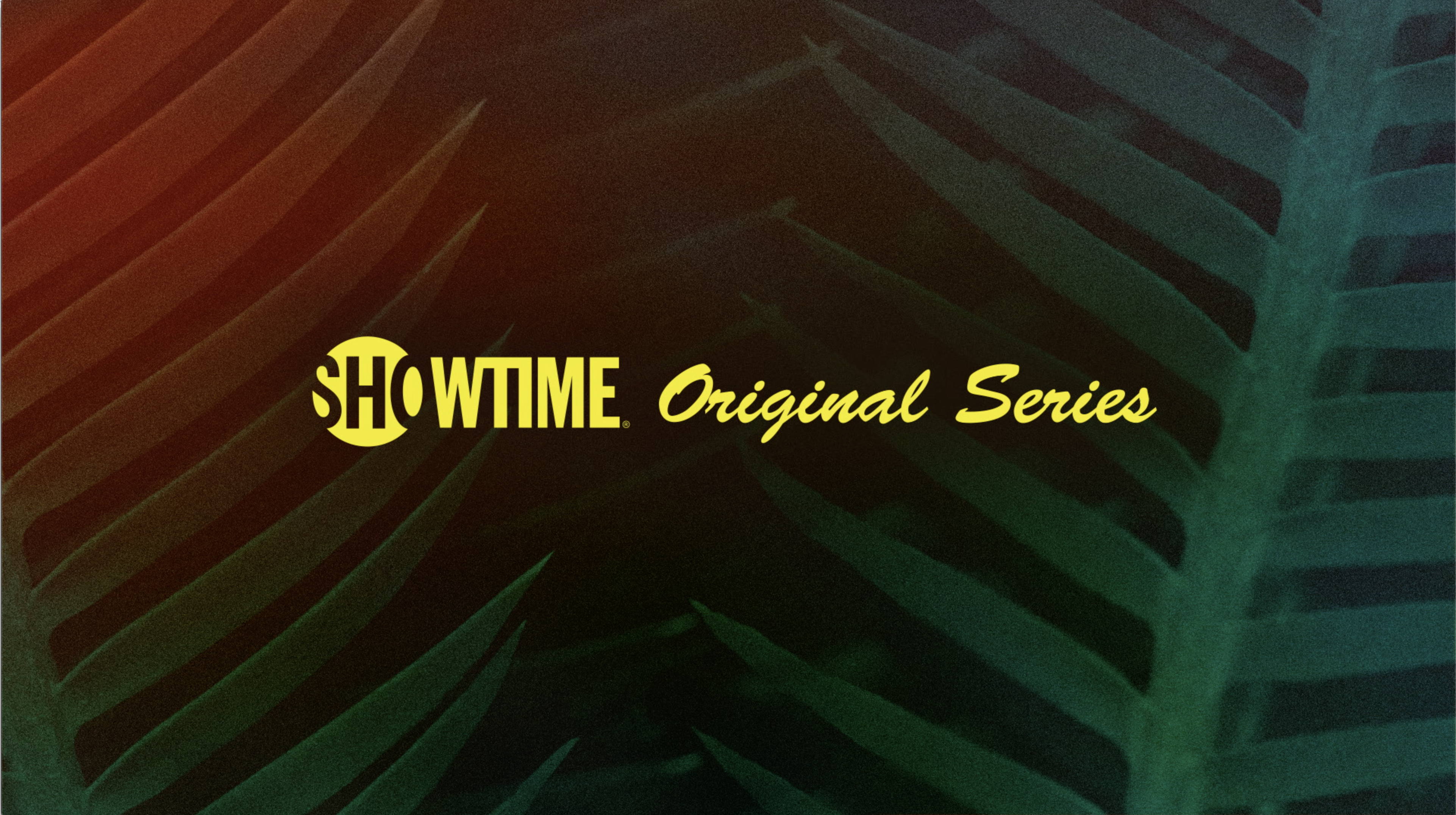
On Becoming a God in Central Florida is hard to describe. I recommend watching the trailer below and then watching the whole series. The task for the packaging was to get across that while the series is wacky and deals with trashy people, it’s also quite dark and sometimes even surreal. Background images are extreme close-ups of Florida flora and fauna (ferns, flamingo feathers, pineapple, alligator, etc.) tinted not-quite-right colors and just shadowy enough to make you wonder what’s lurking within.
Promax Awards North America 2020 Gold winner for Dramatic Program Campaign.
Credits:
Erik Friedman, Creative VP
Christina Black, VP, Creative Director
Rachele Honner, Creative Director
Ana Sanchez, Art Director
Amber Kusmenko, Designer
Justin Acree, Senior Animator
Jon Smith, Lead Technical Animation Artist
John Manigrasso, Executive Producer (trailer edit)
Soon Kwon, Writer/Producer
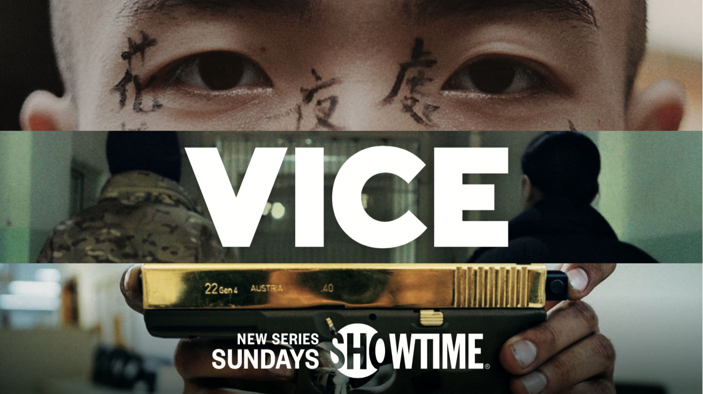
Art Direction: Packaging for Emmy-Nominated VICE Docu-series
Delivering immersive reporting from the frontlines of global conflicts, civil uprisings and beyond, the VICE team of journalists rapidly adapted this past season (Showtime’s first) to cover stories of the Covid-19 pandemic and its rippling effect on local communities around the world, reporting from high-risk epicenters in New York, Italy, Brazil, Iran, Cambodia, and more.
The VICE team handled key art creation [pictured] for the Showtime incarnation of their much-lauded news docu-series. We used their confident, straightfoward horizontal grid to build our packaging system. We always break our grid into thirds: the top panel contains eyes looking straight to camera; the second contains an environment; and the third is always a detail of a person or object. We were strict about using the gridded layout for every deliverable - logo transitions, internal text cards, and even the placement of lower thirds. The animation is eye-catching and energetic while still feeling respectful and not sensationalizing the important subjects each episode covers.
One goal for the packaging was to educate people that VICE (which has previously aired on the Vice television network, on HBO, and on Hulu) is on Showtime now. We tied the logos together into a transitional element, so you never see one without the other. This useful device served another very practical purpose: most episodes of VICE contain multiple segments. We use the VICE/Showtime logo transitions to separate topics in our trailers and episodics.
Credits:
Garrett Wagner, SVP, Executive Creative Director
Christina Black, VP, Creative Director
Amber Kusmenko, Art Director, Designer, & Senior Animator
David Winkfield, Animator
Rosanne Raposo, Lead Graphics Producer

Art Direction: Packaging for Matthew Heineman’s The Trade Docu-series (2020)
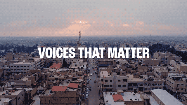
Season 2 of The Trade is a 4-part, standalone docu-series which premiered at the 2020 Sundance Film Festival. The series delves into the shadow industries of smugglers and human traffickers who prey on the thousands of Central American migrants making the dangerous journey to the United States every year.
The brief: make the trailer feel like a thriller, not a documentary. The aspect of the narrative that’s most emotionally resonant is, “how far would you go to protect your family?” We stayed away from broad cliches about immigration that focus on country-specific imagery or politics. Our design explorations focused on the personal aspects of the journey: the road beneath your feet, the possessions you carry, the shelters you might stay in along the way. We built design frames from the point of view of the person walking the road or hiding, not the point of view of a removed “observer.” In the end, we decided to let Matthew Heineman’s beautiful, melancholy drone footage serve as the backplates for the on-air packaging, raw and untreated.
Credits:
Erik Friedman, Creative VP
Christina Black, VP, Creative Director
Rachele Honner, Creative Director
Amber Kusmenko, Art Director, Designer, & Senior Animator
Jon Smith, Designer
Justin Acree, Designer
Ana Sanchez, Designer
Rosanne Raposo, Lead Graphics Producer

Design Exploration:
